
I was on a roll yesterday (Saturday March second) like I haven’t been on in a while. Last week I wrote about printing out proofs for my “The Great Gatsby” illustrated book and this week I finished up four illustrations for it.
In printing out the book so that I could see the book design in print rather than on screen I saw that I was two illustrations short. I’ve made dozens of illustrations for this book so I figured, “What’s two more?” and got to work on them. I drew and inked those two illustrations on Thursday and Friday so they were ready to be colored (digitally in Adobe Illustrator) on Saturday.
The coloring went fairly swiftly because last year I made an entire 80 something page sketchbook full of ink textures that I scanned in and had ready to go. I used the textures as part of my coloring process to ad interest to the drawing. Having so many textures to choose from, and each could be changed digitally, already done speeded up the process considerably. I’m glad I made them all.
Oddly as I was doing these two drawings I didn’t have specific spots they would go into the book. They were more “Spot Illustrations” than illustrations of specific scenes. Spot Illustrations are more general. I had two specific chapters that needed one more illustration each so I looked for a place to put them in each chapter. One fit in perfectly but the other did not.
Oddly again the other did fit in perfectly if I removed one of the illustrations that I had already finished. Coincidentally that was the illustration I liked the least in the book so I decided to drop it out. Of course that also meant that I still needed one more illustration to replace one of the last two that I was making. But first I had to color a third illustration.
In printing out the proof I noticed that there was one uncolored illustration. I guess I placed it in the book design and thought to myself, “I’ll color it later” and never did. At least until then. I took the time to color that one much in the same style as the first two and that also gave me time to think about that last drawing that I would need.
By the way I’m glad I have a working inkjet printer again because as part of the process of coloring these I print them out on 11×17 inch paper so I can proof them and see what they look like on paper. It often takes a few printouts to get the color right but with these ones on that day it only took one or two printout for each one. I was really on a roll.
After finishing coloring the third illustration I decided that I was going to try and find an image to use for the last one among my “Three Marker Style” drawings. Those are a series of ink drawings that I’ve made over the years that have no destination. I like to do them to work out images. I sometimes use the ink drawings as a basis for some of my “Big Ink Drawings” but mostly they exist on their own. I’ve done a couple of hundred of them. I even used a few of them in making this Gatsby book.
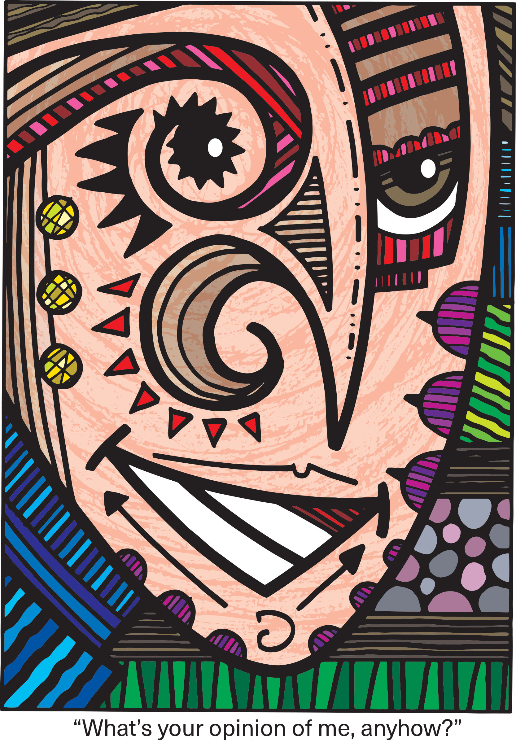
I didn’t look through the actual drawings but I did look through the folder of scans I have of them. This is another reason I scan in everything I do. It makes it easier to look through stuff. I shuffled through the folder of scans and not a lot of things jumped out at me. They are a lot of weird drawings that aren’t literally related to Gatsby in any way. I saw a couple of near misses in the first hundred or so drawings but then came upon one that I knew would work. It was a strangely drawn face of a man and I knew it would work with the line where Gatsby asks Nick “What do you think of me?”
When I make a “Big Ink Drawing”out of these “Three Marker Drawings” I usually take the time to redraw the small drawing to fit the larger format. But I really didn’t have to do that here. I’d be using it at a smaller size and I’d be making it into vector art so that I could blow it up without losing quality. So I just got to coloring it as I had the other three. Pretty soon it was done.
The roll I was on lasted all day. I started working at about 8AM. I think I finished the first piece at about 11AM, the second at around 2PM, the third at about 4PM, and the fourth at about 6PM. That’s a long day and I’m not as young as I used to be but I paced myself well and didn’t have to push to finish. In my youth I could push through and finish a piece late in the day but it takes too much recovery time if I overwork these days. I would have just waited until today to finish it but I’m glad I didn’t have to.
I changed one last thing at the end of the day. As I looked at the printouts of the four pieces I din’t like the background design of one of them. It was the “It’s Romantic” one and the whole piece was in a box. It’s a face in a box. I thought it would look better if I brought the left and right sides of the box in so that they were behind her head. Luckily that was easy to do digitally and I finished it up in about twenty minutes and I was done for the day.
And what a day it was. I’ve almost got the project finished. Though I haven’t decided on a front cover yet I have two of them done. Plus I haven’t printed out the covers or the drawings I did for the front and back pages but that won’t take long. I think I finished the book on Saturday. Or close enough. There is still some design work to be done but all the illustration are finished. I started this project back in January of 2022 so it’s been over two years that I’ve been working on it. It’s good that I can get on a roll after all that time.
I’m back from the comic shop this week and I got eight new comics.
Check them all out here:
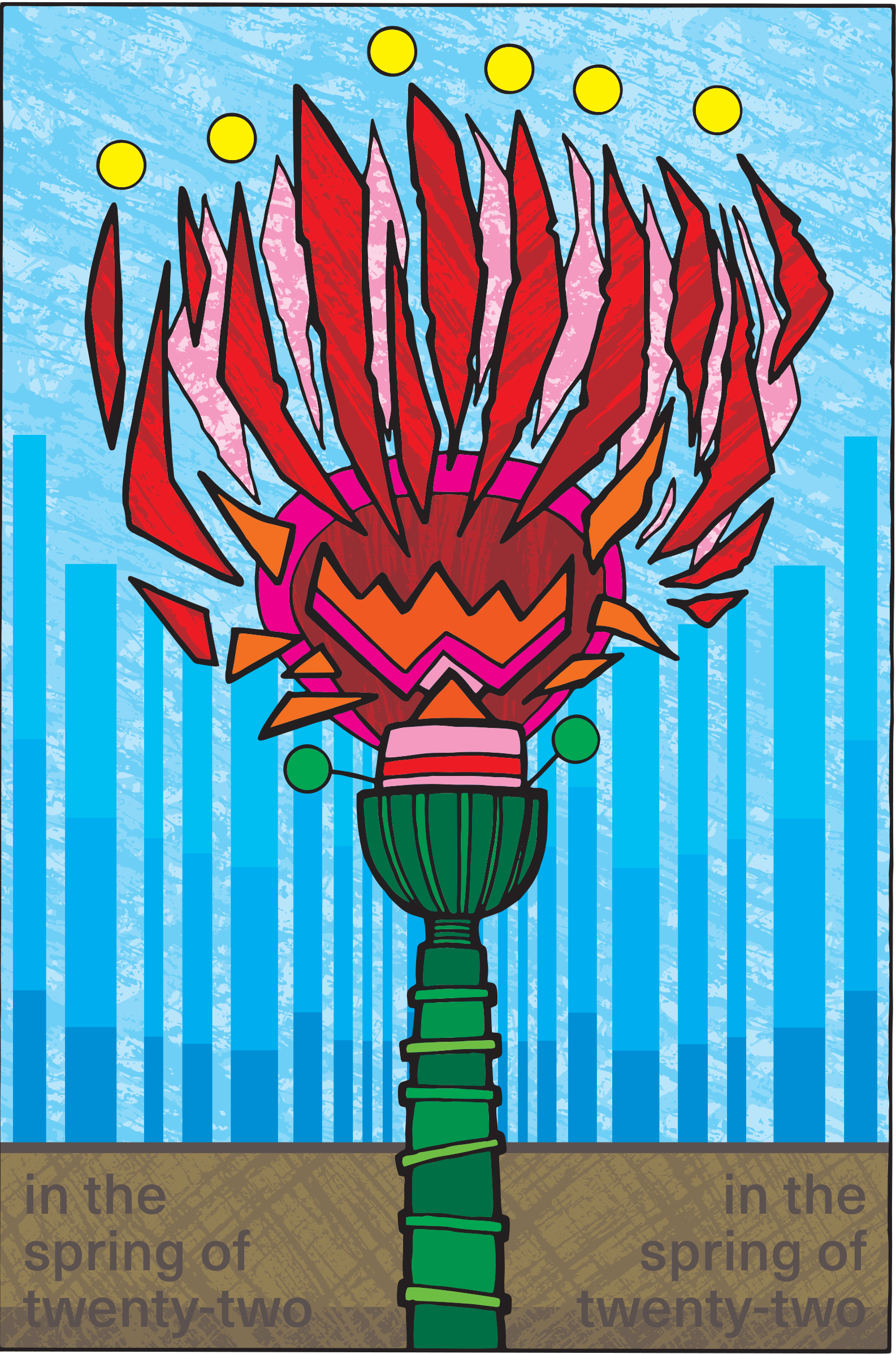
Great Gatsby Logo Sketch
After about two years and two months (it’s February 25, 2024 as I write this) I finally have a printed proof of the illustrated version to “The Great Gatsby” that I’ve been working on. I had to print it out myself and that was quite an adventure. Just three weeks ago I wrote about having to buy a new printer but then I had to return that printer and get another one because that first one was a lemon.
The new printer had printed just fine for about two weeks. I printed all my usual stuff and had no problems. But then I went to print a proof of “Gatsby” and the printer stopped working after printing a bunch of pages.
In my first attempt to print a proof I decided to print it nearly full size. I have the book set up to be a large 9×12 inch book so I wanted big printouts. I decided to print two pages across on 11×17 inch paper. This made the individual pages somewhere around 8×10 inches.
The easiest way to print a book on a home inket printer is to use Adobe Acrobat and its “Booklet” function. When printing a book you have to print on both side of the paper and depending on how many pages you are printing any individual 11×17 inch piece of paper has four pages on it but those four pages aren’t in a row. Since the pages get folded and nestled into one and other they are printed non-consecutively. The “Booklet” setting takes care of all that.
My printer also doesn’t print on both sides of the paper. The “Booklet” function takes care of that too. I use the “Print Fronts Only” feature and then when it’s done printing the fronts I flip the paper over, put it back in the paper feeder, and use the “Print Backs Only” feature. By the way you need double sided inkjet paper if you want to print this way.
I got about 32 pages out of 176 done before I started to have a problem. That problem was that the paper feeder on the printer stopped working. It would whir and click but a sheet of paper would never be fed into the printer. For two hours I tried everything I could to get it to feed the paper properly but it never would.
It’s funny how I sometimes blame myself when equipment goes bad. As I was trying to get the printer to work I was wondering what I was doing wrong. Despite the fact that I had been using this same model printer for eight years before I got this one and never had this problem it still took me a couple of hours to reach the conclusion that I was doing nothing wrong and the printer had to be returned.
The next day, a Wednesday, I had the printer on its way back. Then on Thursday I ordered a new one that arrived on Friday and was set up on Saturday. That’s a pretty fast turnaround but still I was low level anxious because I wanted to finish printing my proof.
The first proof I tried to print was the 11×17 inch one. Plus it was on double sided matte photo paper. That’s quality paper and it takes a while to print each page. I liked the way it looked but after my printer broke I decided that the size and paper quality was too good for a first proof. Plus it was slow printing.
After I got the new printer I switches over to 8.5×11 inch plain paper. With two pages across that meant that each page was only about 5×7 inches. That’s about the size of a small paperback and not the art book that I’ve been making but for a first proof it will do.
The quality of printing on the illustrations won’t be that good but that was okay. I printed out each illustration as I finished them and they were printed at full size so I’m not worried about proofing their quality. I have already done that. This first proof was all about the book design and seeing the project as a book.
Photo of Gatsby Painting
I printed the book in 16 page chunks. That made things manageable. First I made a PDF of the whole book together and then I cut those PDFs up into sixteen page sections. There was no automatic was to do this so I cut and pasted every sixteen pages into a new PDF. A single sheet of paper would have two pages on the front and two on the back so it would take four sheets of paper to make one sixteen page section.
The proofs print a lot faster at this size and quality too. A single side of photo quality 11×17 inch paper would take a couple of minutes to print. That same side on 8.5×11 inch plain paper would take twenty seconds to print. The quality was less but that was okay for now.
After I printed one of the sixteen page sections I’d fold the paper in half, fit them together like a magazine, and then staple them in the middle. I still have my long reach stabler from my ‘zine days in the 1990s so the stapling was easy.
After it was all printed and stapled the sections together were about an inch thick. I decided I wanted to bind them with some string. I first clipped them together with some big alligator paper clips and then got out my electric drill. With the paper held firmly in place I drilled four holes on the left spine. String went into those holes and was tied off. I’m not much of a book binder but that method worked well for this proof.
I still have to look through the proof and examine it for mistakes. I already know there are a bunch of things that need to be fixed but I haven’t wanted to face them just yet. I think I’ll just enjoy seeing it in book form for a little while. Then I’ll get back to work on it. Printing this proof has been a journey.
I’m back from the comic shop this week and I got eight new comics.
Check them all out here:
My sketch is the top left and all the others are AI art.
I’ve been tinkering with AI art lately to try and figure out what it is and what to do with it. For those who don’t know, AI art is using artificial intelligence to create art for you. It looks at all the art on the internet and using that knowledge makes a picture for you as you describe it. It’s a threat to the livelihood of a lot of working artists because it uses their art to make them unnecessary in the process of commercial art. Why hire an artist when an art director can just describe what he wants to a machine?
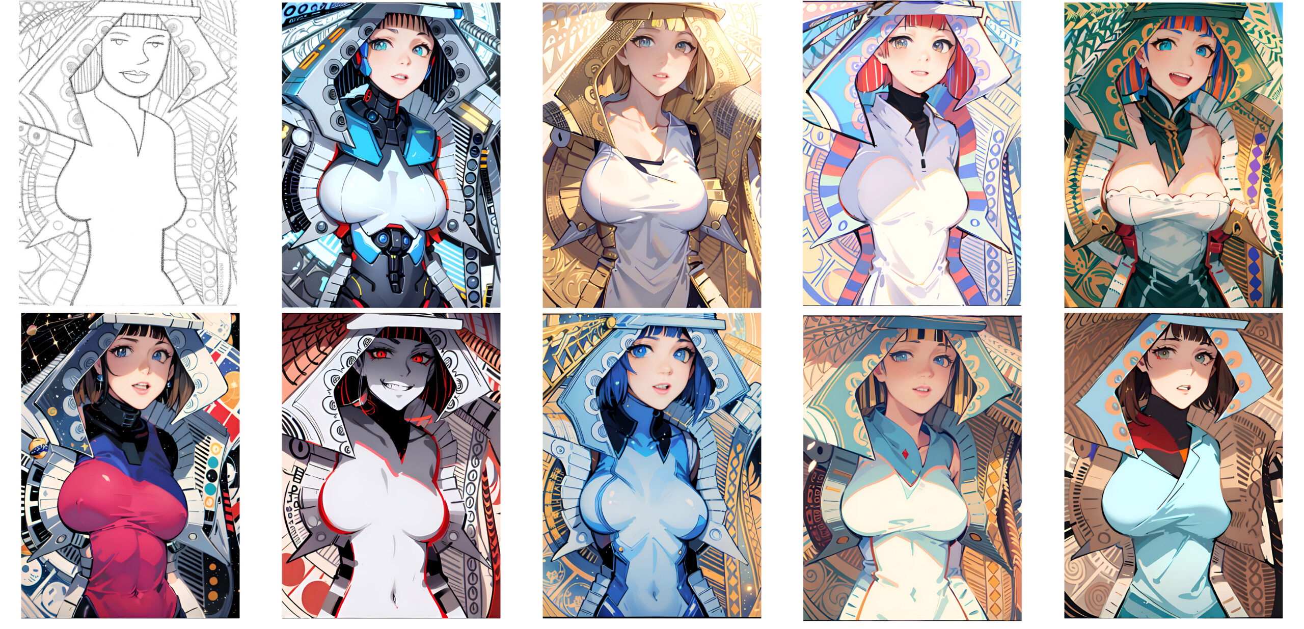
The first AI art app I tried was one that didn’t use descriptive writing to make art but used my own art as a starting point. I fed one of my sketches into the app and then it remade my sketch into a finished piece of art in one of the many popular styles the AI was trained on. This one was mostly Japanese Anime styles.
This attempt blew my mind. The result of it working with my sketch was that it made some really nice art but whose art was it? The art would not have existed without me and my art but I also wasn’t the one who actually drew it. You could tell it came from my art if you knew my sketch came first but if you didn’t then it existed just as well on its own. That’s a crazy thought.
One part of this AI art that blew my mind was that it looked to me like people, in general, would like the AI art better than mine. I’m not a popular or successful artist but I like my own work. Otherwise I wouldn’t be making art. But this AI art was taking my art and redoing it in a popular style. By definition it would be more popular than my artwork if people had to choose between them. It’s a bizarre feeling. It’s like somebody making a robot of you that is better looking and more liked than you are.
I ended up calling this version of AI art as “Push Button Art” or “Art From the Machine.” All I had to do was feed my art into it, push a button, and a new piece of art would come out of it. Plus it had many buttons (styles) I could push and a completely new piece of art would come out of the machine. It’s mind bending for an artist.
The second type of AI art that I tried was the type where you write what you want the picture to look like and then the AI makes that picture. As you can tell from this blog that I’ve written week after week and year after year and I’m a writer as well as an artist. So this version of AI art was really easy for me. I could do it as I sat there and watched tevlevison.
This is how it goes. I write a description of the picture that I want, pick a style for it to be done in, and then the AI would give me four pictures done as I described. They weren’t all great but generally close to what I wanted. I could then further refine them but writing more stuff. It’s all about the description and keywords. No artistic talent needed.
This type of AI gave me cognitive dissonance. I expected it to be bad machine art. I wanted it to be bad machine art. I immediately found all the flaws I could in it. But in the end it really did a good job of making an illustration. It is really good at copying techniques. It’s really good at “Pretty” and people like pretty art. I want it to be terrible. I want it to be obviously machine art but it’s not. There is where the cognitive dissonance comes from. It’s giving me a headache just thinking about it.
My print is the top left and all the others are AI art.
I started a new series of drawings and prints called “Last Night I Dreamt I Had a True Love.” I’m going to use that line in each of the images I come up with. I’ve done this sort of thing before with my “Unchain Your Brain” series. I started working on the first one and was having a hard time coming up with ideas. It’s a new series so that is expected. So I decided to try using AI art as an experiment. More cognitive dissonance.
I ended up finishing my first print in this series and it took me three days. About 25 hours worth of work. It only came out okay. I like it but I think I can better capture the mood I’m going for with the next try. Meanwhile I was also making some AI versions of the theme. During the Super Bowl and the following week as I was watching TV I’d write some descriptions and let the AI art do its thing.
I ended up with four finished AI “Last Night I Dreamt I Had a True Love” prints. Each one was a fully rendered illustration that took me about two hours. A lot of that time was me doing some design work over the Illustration. I wanted them to be terrible but they weren’t. And as I said I’m a writer so it was easy for me to write the descriptions. Plus I think they captured the mood I was going for better than mine did. It was all too easy. Plus all four prints were prettier and in a more popular style than mine was. I guarantee you that the average stranger will like them better than mine. It’s mind blowing.
I ended up thinking of this kind of AI art as doing a puzzle. When someone puts together a puzzle they do work to make a picture. The difference is that when a person shows off that puzzle that they made the viewer might say “Nice job” and appreciate the work that went into solving the puzzle but they never think that the person is the actual artist behind the art on the puzzle. I’m afraid to show the AI art that I made to anyone because they might think that it’s my art but I really think it’s just the puzzle I put together.
It’s further not my art because I’m really just the art director on it. It’s the art director’s job at a company to hire illustrators to make art. The art director has a vision for how they want a book cover to look and they hire someone to fulfill that vision. If you’re a really good and well known Illustrator they might hire you for your vision but that has to fit into the art director’s vision too.
With this type of AI art I’m playing the roll of art director. I’m telling the AI how I want the print to look. It comes back with choices and I pick a choice or give it further instructions so I get more choices. I’m not doing the work of an artist at all. So then how could the work be mine in the end? It’s not. We don’t consider the paperback book covers painted by Frank Frazetta to be the work of the art director on those books. They’re Frazetta’s paintings. He did the work.
Now with this type of “Write a description” AI art the machine does the work. It’s the machine’s art (based on art it copied). There is the problem for us artists. The artists and illustrators are no longer needed in the process. That’s scary to us.
I’m back from the comic shop this week and I got eight new comics.
Check them all out here:
Back in December when I was sick (I mentioned it in my first blog of 2024 http://radiantcomics.com/sitting-in-my-chair-getting-well/) I bought some Funko Pops with the purpose of repainting them. It was nothing I had ever done before but I got it in my head to give it a try. After about two months I finally did give it a try.
At first I was planning on stripping the original paint off the Pop and then using a white primer on it before I started painting it. Then I realized that was too much work for something that was just for fun and so that method was never going to happen. Finally this week I grabbed a Pop and used some heavy body titanium white acrylic paint to prime it. I just painted over the original paint since the heavy body white paint is pretty thick and covered well.
My original plan was to repaint the Pops with color but then I decided that was too much work and I was going to adapt my ink on paper monster drawing style to the Pops and make black and white monsters out of them. So I grabbed a brush and some black paint and tried it out. It was a miserable failure. My repaint looked terrible and I saw no way to make it good with just black and white so I grabbed some red paint and added that to the mix. That made it better but not good.
Over the last month or two I bought a couple of sets of acrylic paint pens specifically for drawing on Magic the Gathering cards. Another strange project of mine. Paint pens were the best medium for drawing on those cards so I bought two sets of twenty four pens. The first set has a bullet point and a bigger dot point. The second set has a bullet point and a brush tip (all these paint pens are two sided and have caps and tips on either side of the pen). I decided to try these out on the Pops too. Turns out that they work well. It’s acrylic paint over acrylic paint after all.
That set me off on a bit of an acrylic paint pen spree. I already had the two color sets plus I had a set of ten black paint pens that were sort of ball point pens and to those I added another set of twenty four paint pens that had a small bullet tip and brush tip. After that I bought another set of ten black paint pens that had the brush/small bullet tip combo. I have my eye on another set or two but that’s really it for now.
Luckily these paint pens are cheap. The sets of 24 colors only run about $15 and the sets of ten black pens run about $10. That’s somewhere around sixty cents a marker which is way cheaper than the $6 a marker I pay for alcohol based art markers. Paint pens don’t come with refills though.
I’m still working on repainting that first Pop. I don’t really have down what I want to do. I’m still in the messing around stage. I even want to figure out how to remove the toy’s big head so I can paint the body and head easier. There are instructions online and it takes a hair dryer or hot water but I haven’t tried it yet.
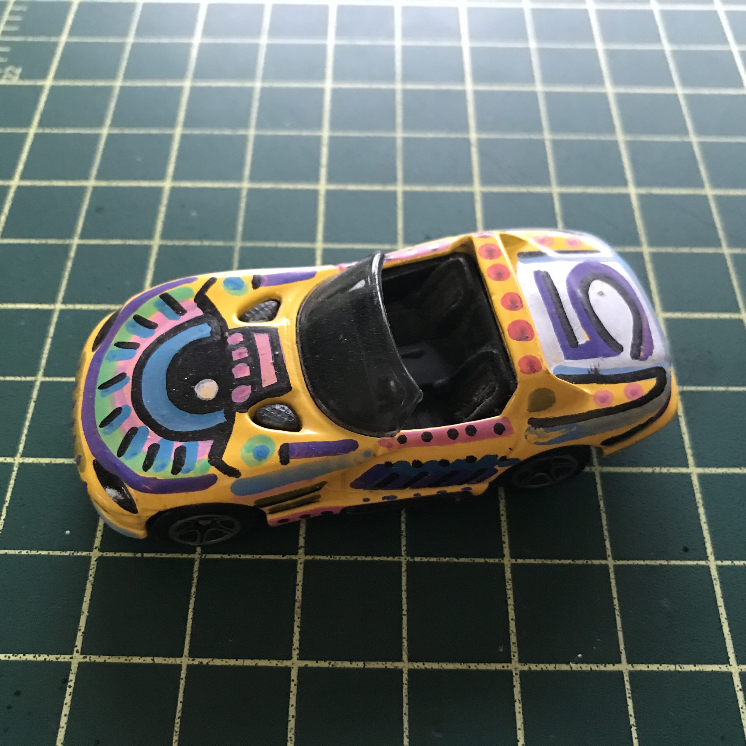
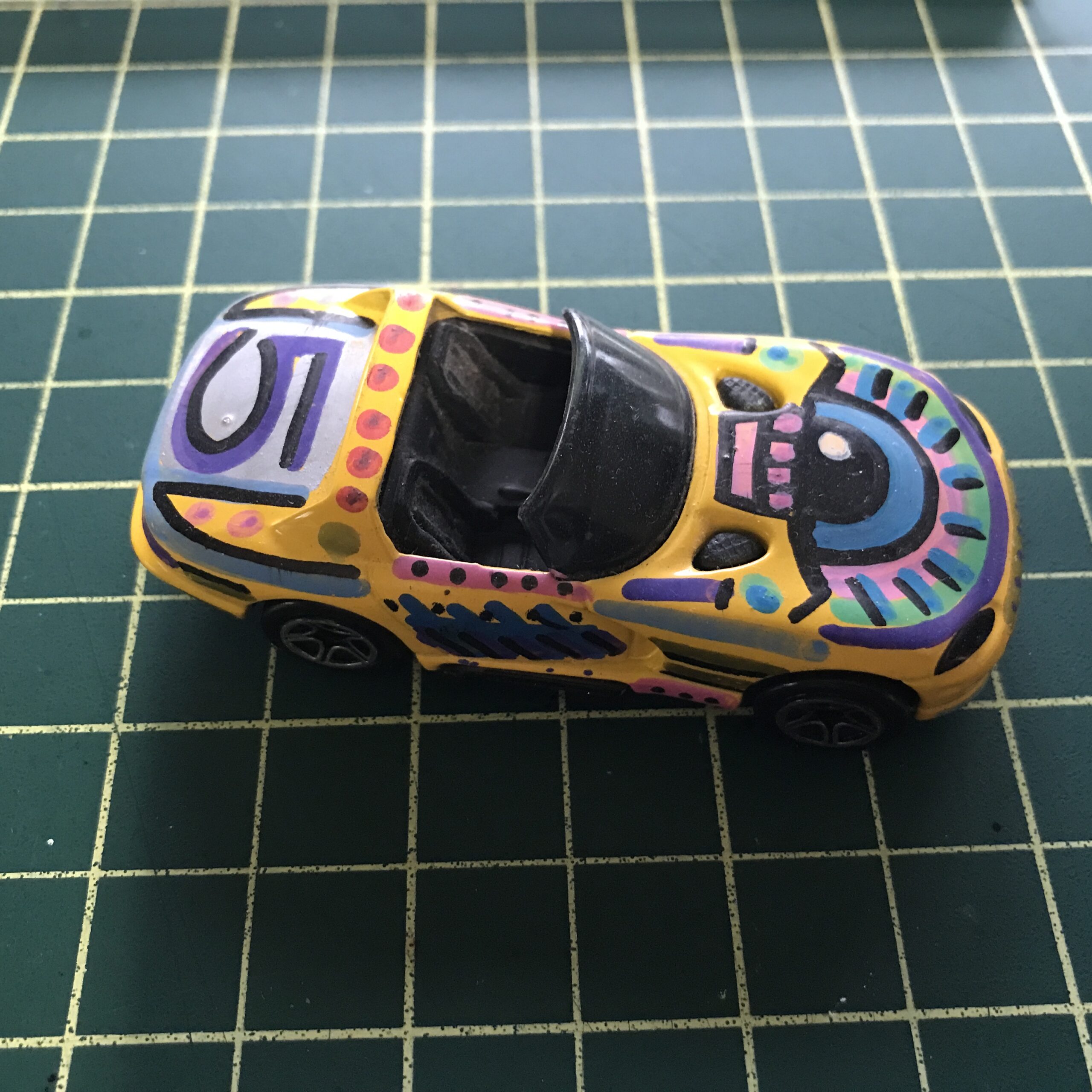
Another thing these paint pens are good for is painting on toy cars. Back in the late 1990s I used to collect 1:64 scale toy cars. Mostly Matchbox, Hot Wheels, and Johnny Lightning cars. At anywhere between $1 and $3 they were cheap to collect. Then I had too many of them and gave up collecting them. But then in 2006 I got the idea to paint them. I bought about twenty yellow Dodge Vipers from Matchbox and used Testors enamel modeling paint on them. I painted designs on about ten of them and they came out pretty cool and then that was the end of that.
As I was painting the Pops it struck me that the acrylic paint pens might work on Matchbox cars too. So I went out into my garage where all my old toy cars are and grabbed one of the yellow Dodge Vipers. The pens worked great on them. They actually worked better than the old Testors modeling paint because the pens were way more convenient and dried faster. Though I was just playing around with designs on the car it came out better than the Pop did. Probably because it wasn’t my first time painting on a toy car.
Now the main problem I have with painting the Funko Pops is what paint on them. A lot of people who repaint Pops make other characters or celebrities out of them. I don’t really have much interest in that. I think I just want to make them fun art pieces but I haven’t figured out what that means just yet.
Another problem I’m having is that I’m getting random cheap Pops, $3 to $4 a piece instead of $10 to $15 a piece, and the ones I get might not be the best ones for repainting. The one I’m starting with is the Bard from the show “The Witcher” and he is holding a guitar. What am I going to do with that guitar?
I also just bought another $3 Pop that is from some superhero movie and the woman is flying. She has a trail of plastic “Energy” behind her that acts like a stand so she can be in a flying stance. What do I do with that trail of “Energy?” Do I leave its along or paint it? I have no idea at this point. But I’ll figure it out.
I’m glad to have something new to figure out even if it is just a silly Pop painting project. I’ve been getting a lot of “Dreams of Things” covers done over the last couple of years and sometimes getting the same series done can get stale and repetitive even if I like the results. So it’s good to try something new even if I fail at it. And failure is always option when trying new things.
I’m back from the comic shop this week and I got six new comics.
Check them all out here:
This week I had to buy a new printer. I think I bought my first printer back around 1996. I can’t remember if I bought a printer first and then a scanner or the other way around. It was an Epson Stylus Photo printer and it may even have been a tabloid size printer (13×19 inch). I know that all my printers beyond the first one were that size and I think the first one was too but I’m going by memory so I’m not 100% sure. I don’t remember ever having a letter size printer (8.5×11 inches) but I guess I could have had one.
I stuck with Epson’s for years but they were all a little finicky to print on and the ink was very expensive. Finally I got tired of Epson printers and decided to get a Canon back in 2010. I usually went for the more expensive “Fine Art” photo printers and they ran me around $700. Both the Canon and the previous Epson printers were around that price. The Canon inks were expensive too.
In 2016 I decided to go a cheaper route with a new Canon printer. It was really the inks that were so expensive. Paying $700 for a new printer is one thing but it cost me around $90 every time I wanted to fill it with ink. It was around $12-$15 a cartridge (and they are small) and there were seven colors. I read somewhere around that time that printer ink was the most expensive liquid on Earth. I believe that. So this time I wanted a printer that could use knock-off inks.
Knock-off inks are not as reliable as the original manufacturer’s inks but they are a fraction of the price. I liked the Epson and Canon inks because they were archival and lasted a long time without fading but it turns out I never sold any of the art prints I made with them. So what was the point of them lasting forever? I decided I’d rather go cheaper because most of the prints I made were only temporary anyway. Lots of proof prints to make sure I got things right.
The Canon I bought back in 2016 has five color inks and a set of them will set you back $70. That’s nuts. But with this model Canon I can buy knock-off inks. The last knock-off inks I bought cost me $30 for eight sets of them. That’s right, $3.75 for a set of inks rather than $70. That’s why I went with this model of printer. Maybe the prints made with those inks won’t last forever but I don’t care.
After I got the cheap inks to go with the printer I found that it really freed me up to make prints. When it cost me $15 every time a color ran out, and one was always running out, I didn’t want to make many prints. But at $3.75 for a whole set of colors I printed away. I only had to think about if I had paper. I found some cheap fine arts paper too.
I’ve had trouble with this printer before. A couple of years ago I kept getting errors from it, tried everything I could to fix it, and ended up dropping about $100 on a new print head for it. That fixed things until now. Recently I started getting the same error message. It told me to turn off the printer, unplug it, and start it again. If that didn’t work then call my printer service center (of course I have no printer service center).
That plugging and unplugging, and sometimes having to wait a half an hour for it to cool down, worked over the last couple of months until this Thursday it didn’t. I got the error right away when the printer was still cold. I wrestled with it for a couple of hours but couldn’t get it going. I decided to try it first thing on Friday morning and if I couldn’t get it going then I’d buy a new printer.
Back that couple of years ago when I bought the print head I spent a lot of time looking at new printers. It turns out there hasn’t been a lot of forward progress in printers since 2016. The printer I already had was still the current model in that printer class. I decided to try the cheaper replacing the print head option and hoped it would work. My other choice was to buy another version of the same printer. I can’t remember the price at the time but it was around $250.
So this time I knew if I couldn’t get the printer going I didn’t want to search for another print head but would go ahead and buy a new printer. I gave a look to different printer brands and models but nothing had changed since I last looked a couple of years ago. Plus I still have a ton of ink cartridges for this model so that made my decision easy.
Friday morning I couldn’t get the printer started so I immediately ordered a new one. Same brand and same model. Nothing had changed about it since 2016. At it was still $250.
When the printer came on Saturday it was easy to set up. I removed the old one, cleaned up around it, and put the new one in its place. Thought the printer says it hooks up wirelessly over the network but I’ve always wired it in. It doesn’t even come with a USB cable but my old one was already in place. It was just plug and play from there.
I was nervous starting for the first time. I hoped I wouldn’t get that same orange warning light that I got on the old one. There is no reason I would since it’s brand new but logic didn’t stop my nervousness. But it was all okay and I printed out the stuff I was trying to print before the old one broke down. I’ll still be nervous for a while every time I turn it on but that’ll pass.
I’ll wrap up with the sentiment that I posted on Facebook when my printer broke down. I was annoyed that I was going to have to spend $250 on a new printer but happy that this was a problem that $250 could fix. And that I had the $250 to spare. I don’t think I had the money to spare a couple of years ago back in the Covid days. That’s what I went with the cheaper print head option.
Update: It’s been three weeks since I wrote this and guess what? My new printer was a lemon. It stopped feeding paper two weeks after I bought it and I had to exchange it for another new one. It’s only been one day with the second new one but it’s still running.
I’m back from the comic shop this week and I got six new comics.
Check them all out here: